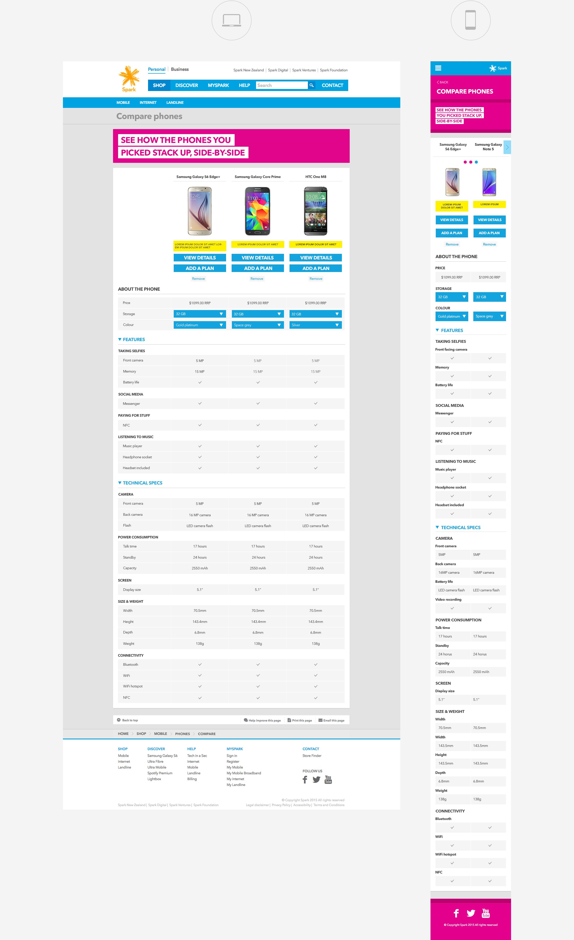
Most telcos around the world have online tools to compare mobile phones – though usually only for a desktop. At the time this project got started, none of NZ’s 3 mobile companies had one. Spark wanted to be the first to get there. They also really wanted the tool to work on mobile which is what became our main design challenge.
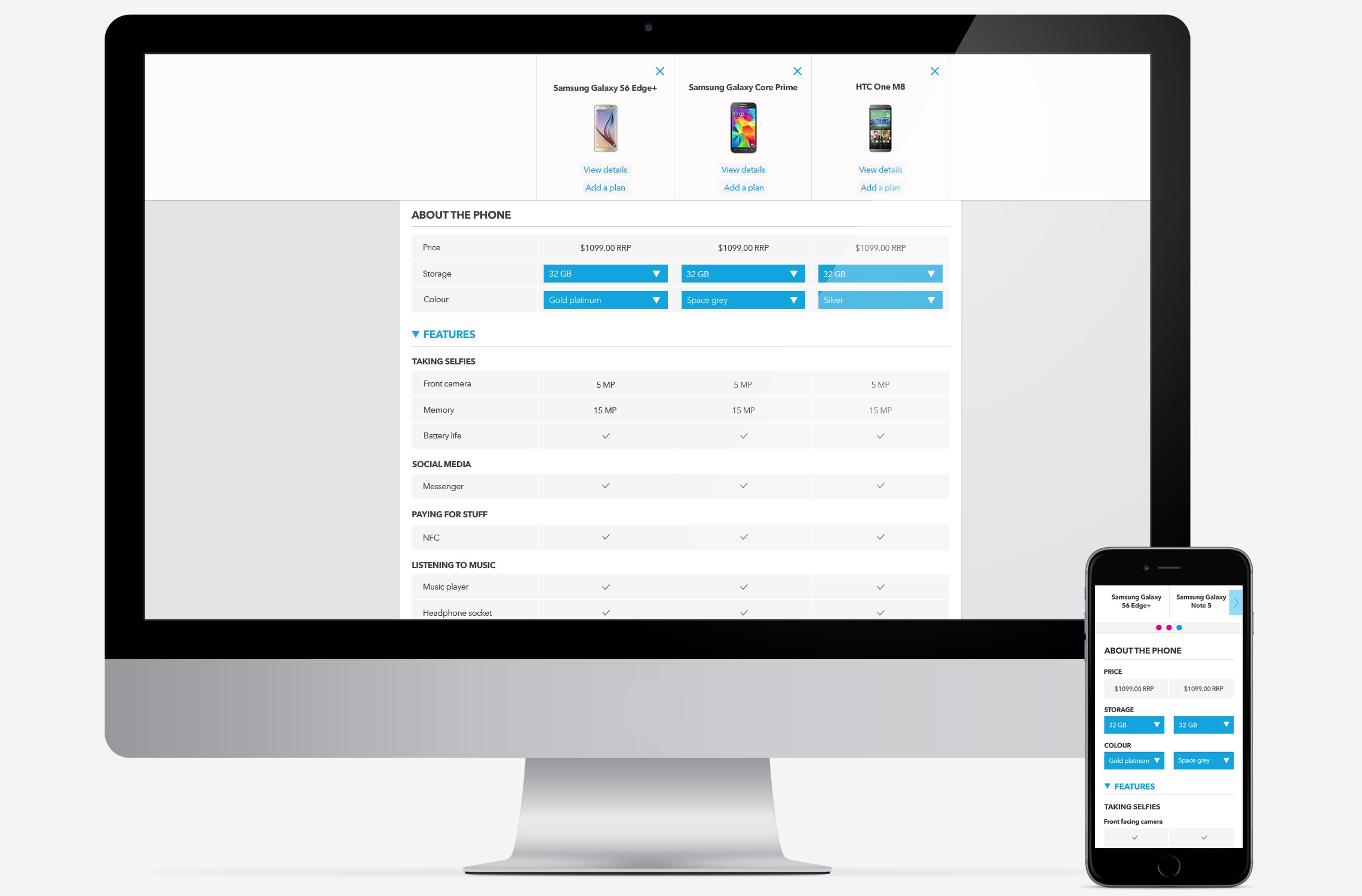
After lots of research and iteration, my final designs hinged on using a sticky header to show which phones are being compared. Whenever a user scrolls down, the sticky means still have a clear idea which list of specs belongs to which mobile.
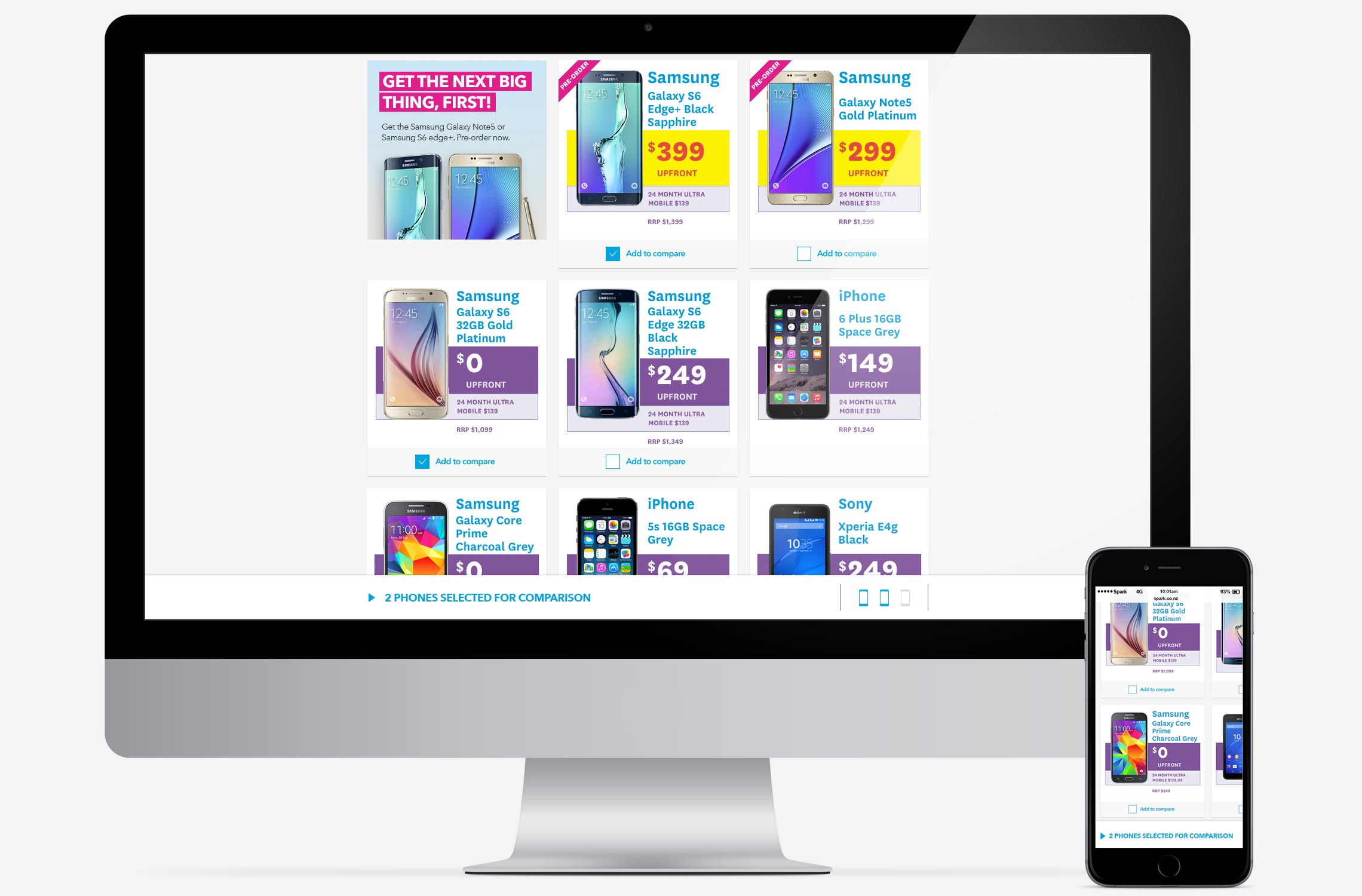
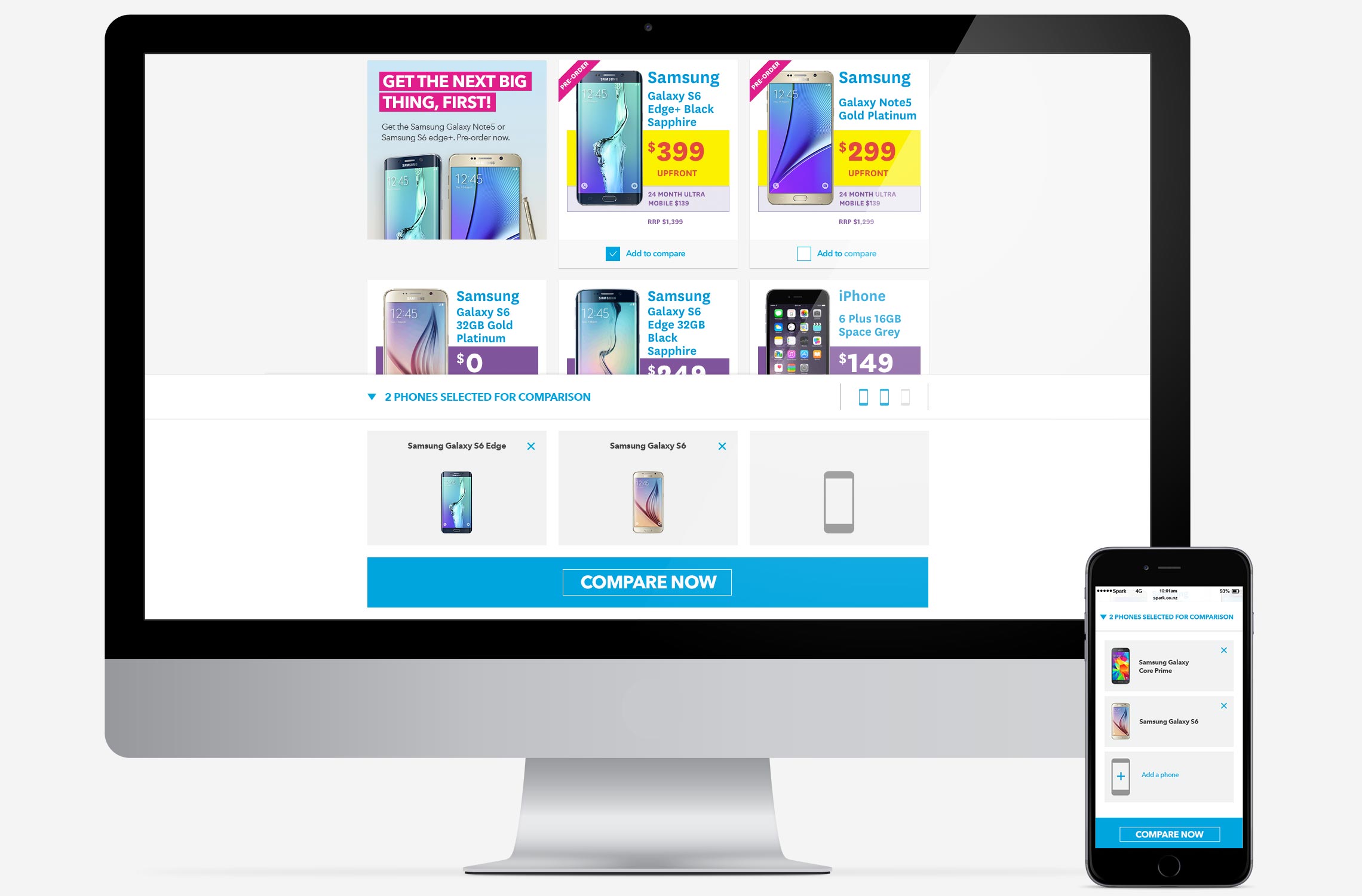
At the foot of the page there’s also another sticky, so users always know how many phones they are actually comparing.


