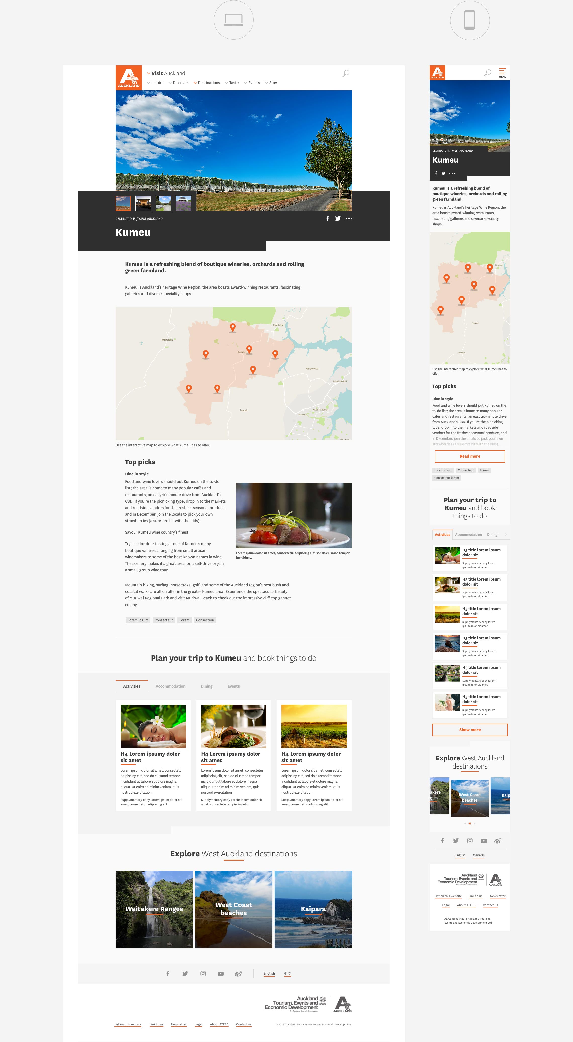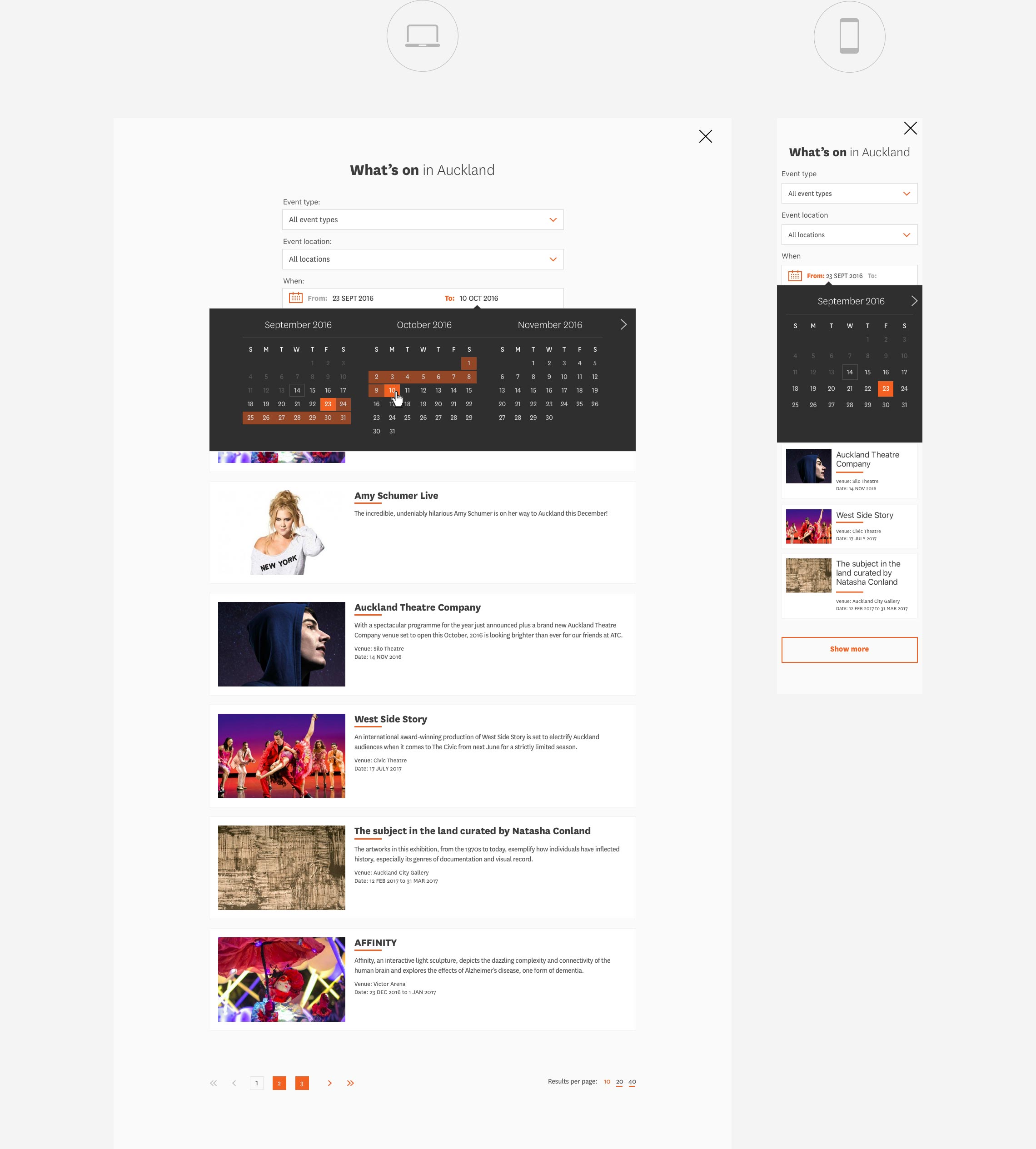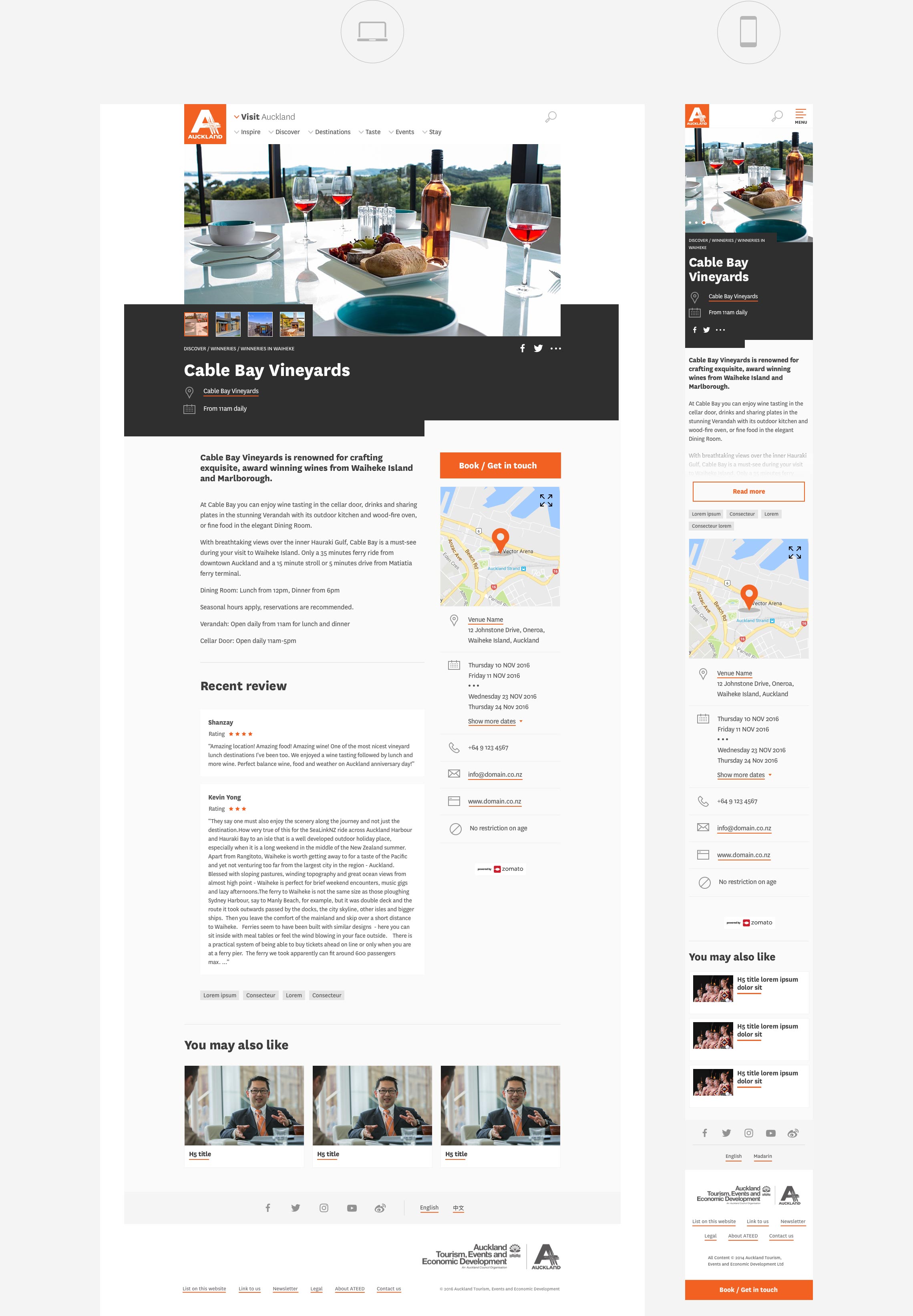
The ATEED website acts like a gateway for tourists and business people, both local and from overseas. They use it to search for information they need to visit or conduct business in Auckland.
Making that search as simple – and as fast – as possible was at the heart of everything we did. It’s why we re-engineered and redesigned the entire site and built a new CMS to support it.
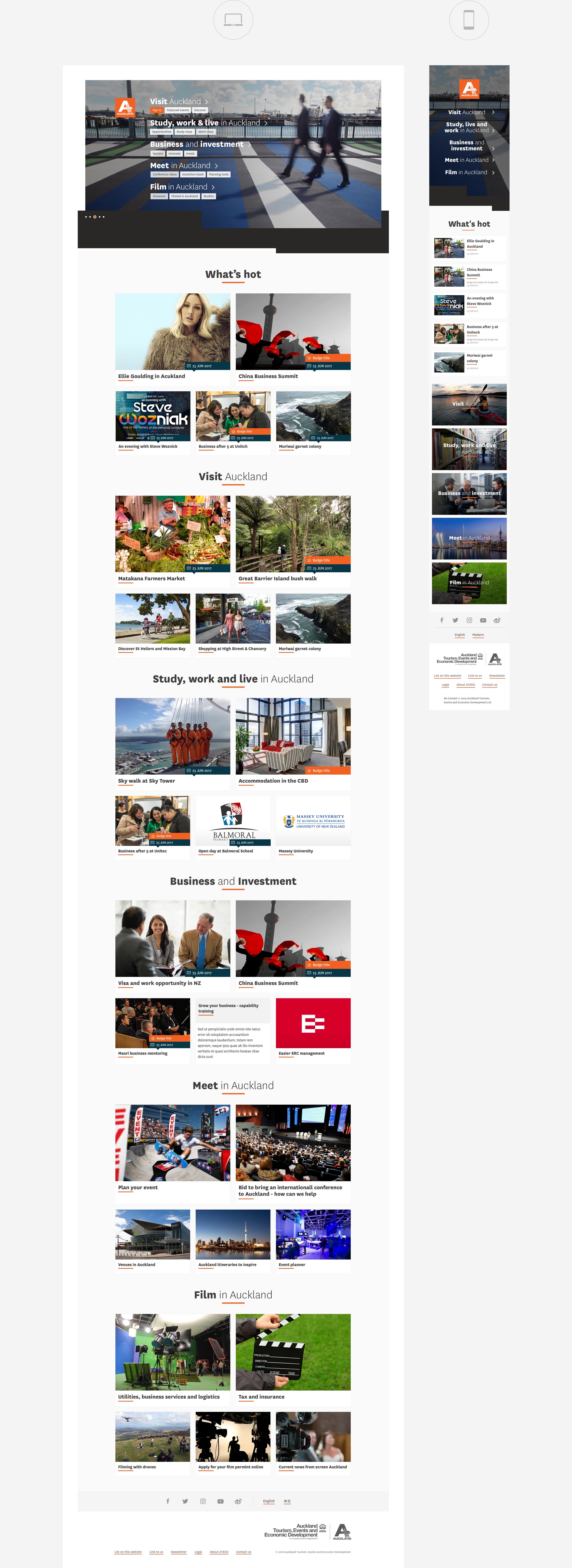
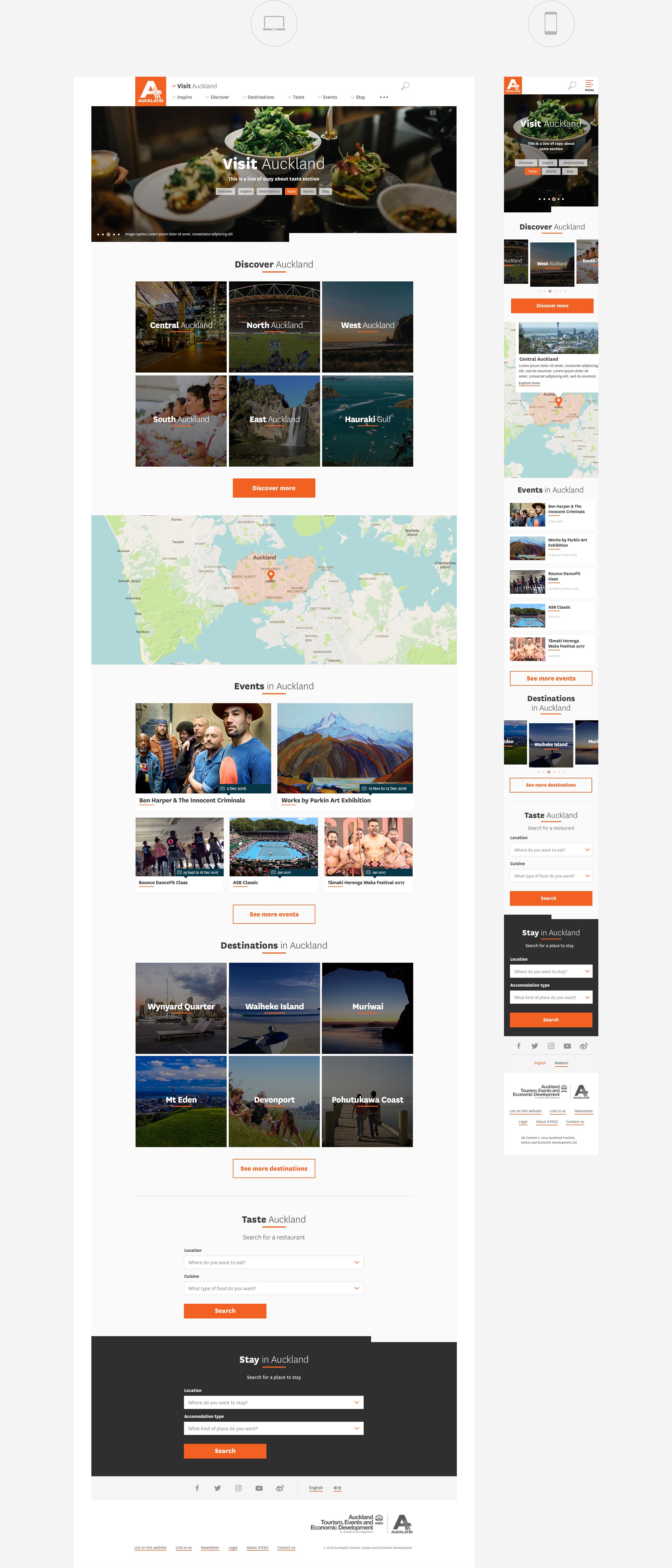
The new responsive design has 4 breakpoints with mobile first very much in mind. We created a pattern library of 20 components and 21 page templates. And because all the components work together visually, content loaders get the freedom to choose what they like to assemble a page.
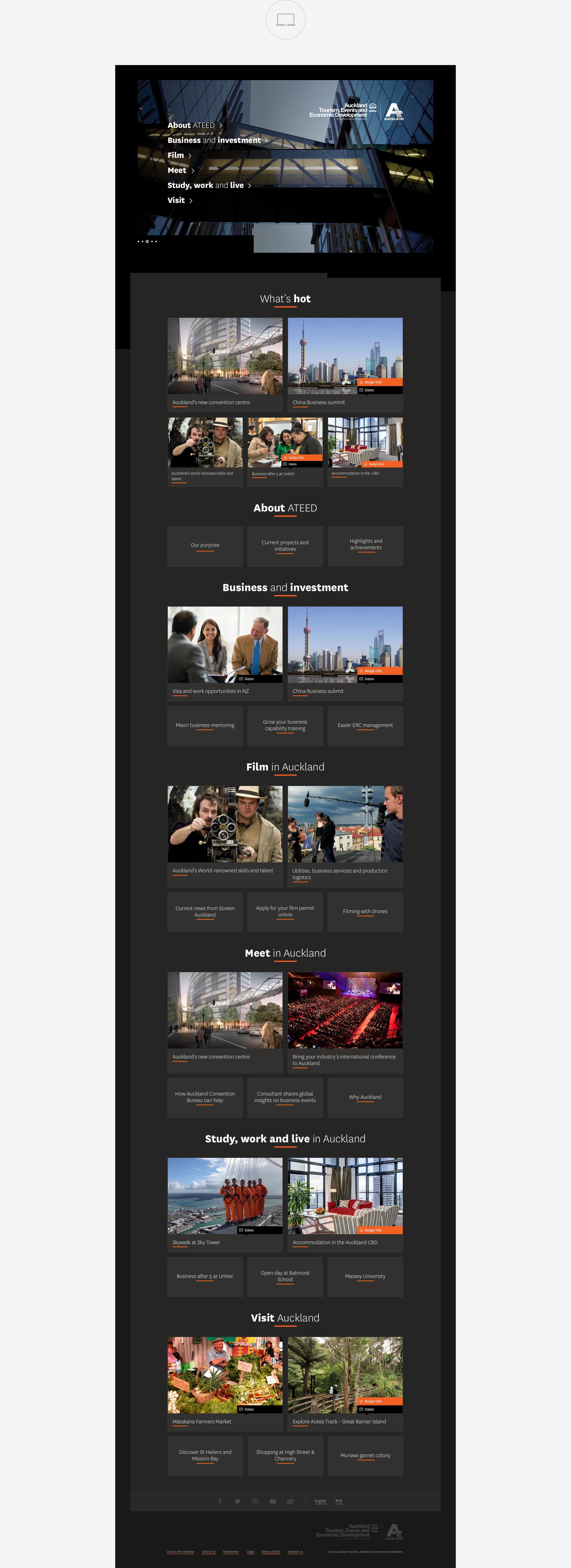
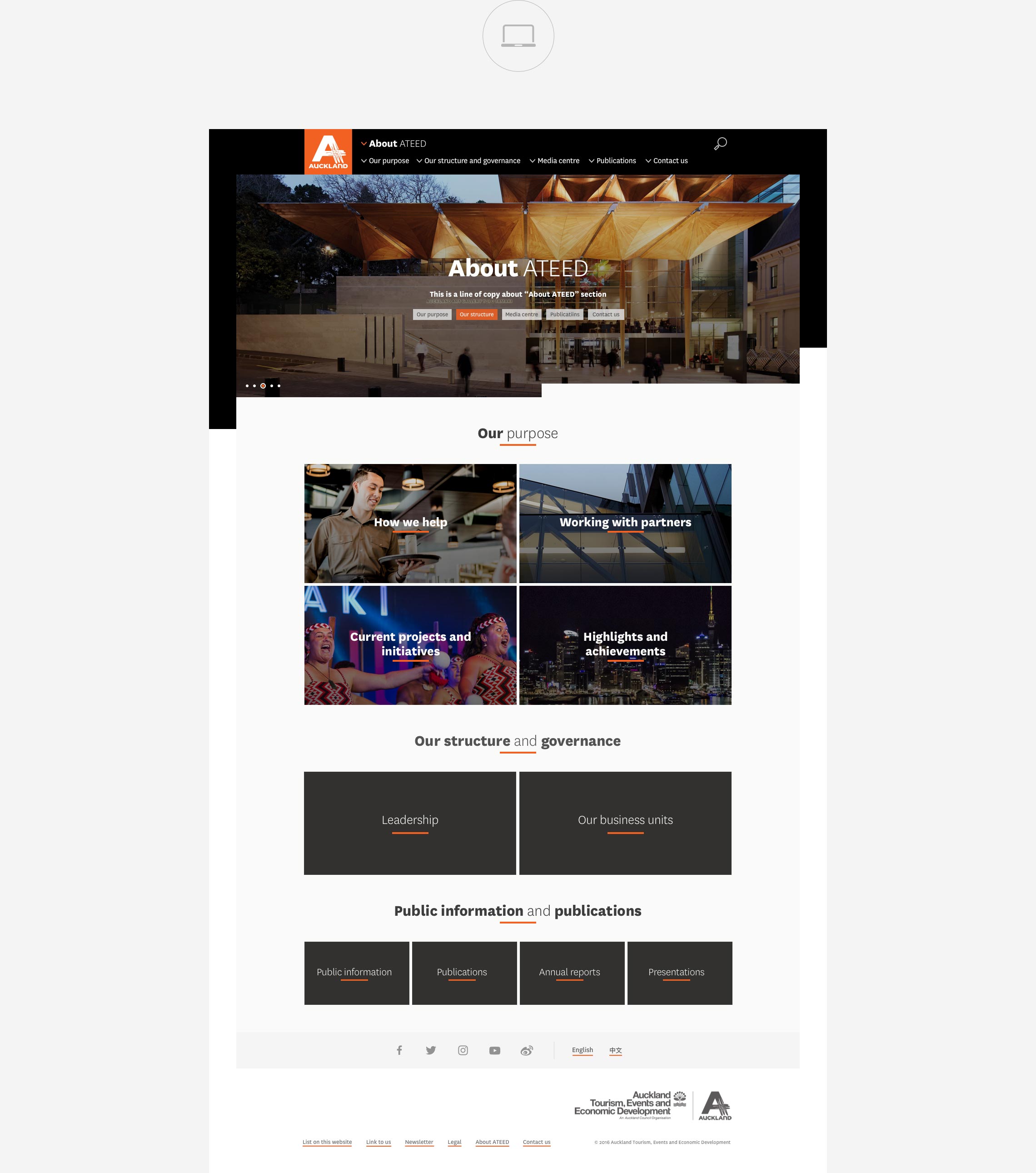
To meet client's requirement on unique idenities, we created three designs for the six main entry points at auckland.com. Those six landing pages can be promoted individually. The first image below is the white version for leisure seekers; the second image, the black version, for business people and the third image, the hybrid version, is for the organisation itself.
The new ATEED site was launched in mid 2017.
